Our Story
OutRecover was built to solve a gap that should not exist.
On one side, traditional medicine. Clinical, reactive, and often slow. On the other, modern wellness. Trend-driven, inconsistent, and lacking structure. People were left in between. They were told to rest when they needed direction. They were given treatments without a system. They were left to figure it out on their own.
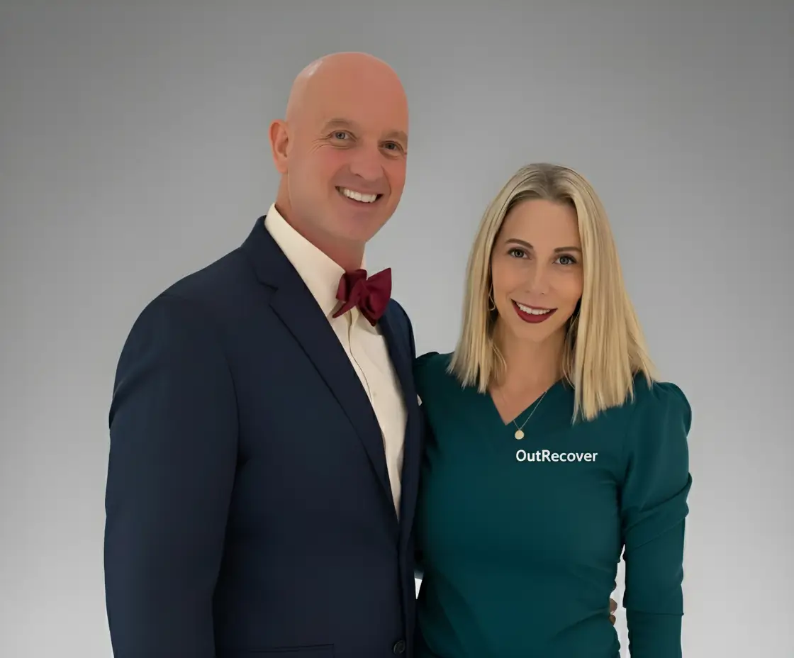
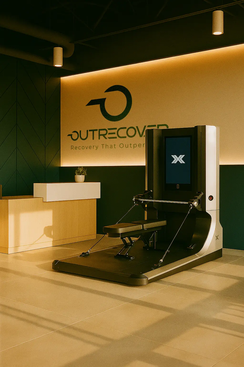
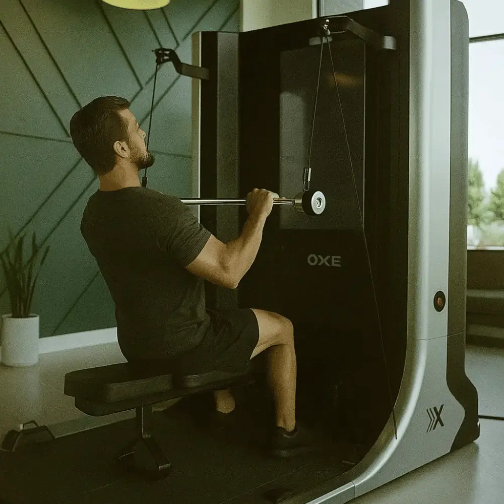
Founded by a functional nutrition expert and an orthopedic surgeon, OutRecover combines medical-grade technologies with personalized protocols designed to accelerate healing, reduce inflammation, and improve performance. Every offering is designed to work together, not in isolation. This is not a menu of services. This is a system built for results.